Liva Healthcare Visual Identity
Liva Healthcare is a danish based start-up who are creating an app for iOS and Android which can monitor help and change the lives of people who are suffering from Type 2 diabetes, obesity, and cardiovascular diseases.
For Liva I first created a logo, it was a long process with extensive user testing, a lot of the initial sketches and logo creations was created, and they all went through user testing – the logo which is presented below is the one which was the one which had the highest remarks in the user testing and was approved by the board of directors at Liva. Equally important is how the icon works in a crowded home screen where a lot of app icons are battling for your attention.
Client
Liva Healthcare
Project Date
August 2021 - January 2022
Category
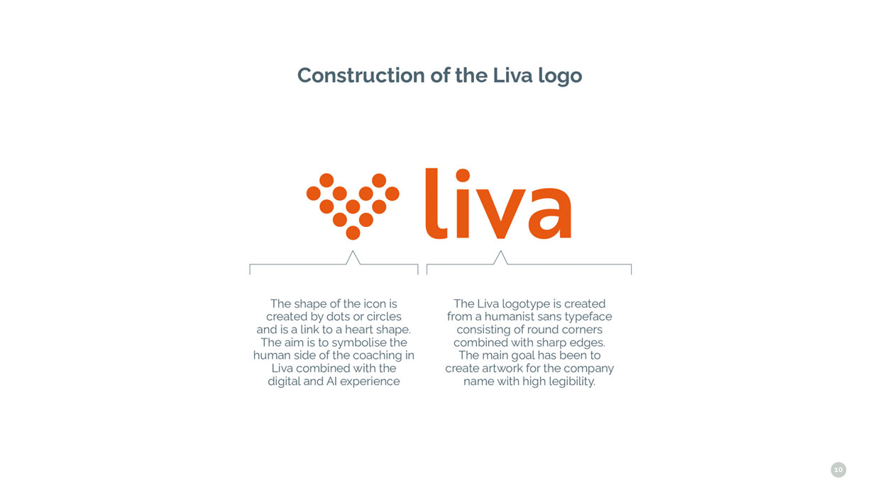
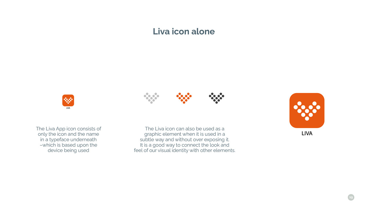
The icon consists of 12 dots which is a symbol of the heart and also an arrow pointing you in better directions for your life. The reason and the thought behind the dots creating the artwork are that you are part of a group and not alone – one of the core elements of the Liva app is that you are connected to a healthcare coach and part of a group with other people in the same boat as yourself.

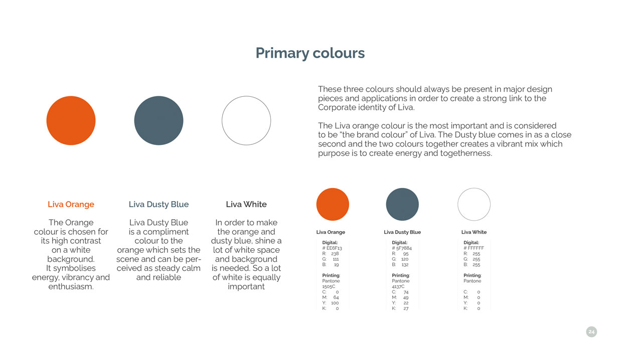
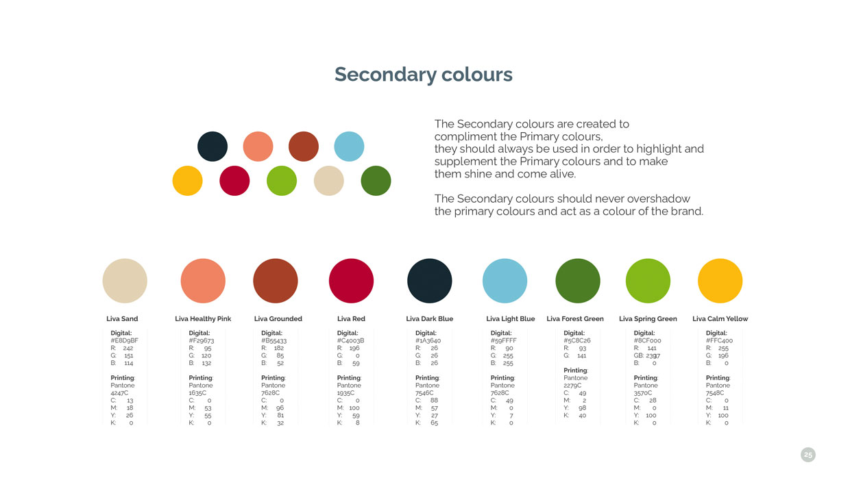
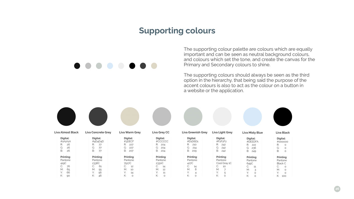
The color scheme for Liva is quite vibrant, and it is also a shift in direction from their old Visual Identity which consisted of colors that you typically relate to scientific and hospital use, so in the turquoise, green and blue segment. Liva wanted to shift its focus to a more consumer-oriented segment and get away from the perceived look and feel of being “only” a pharma provider.
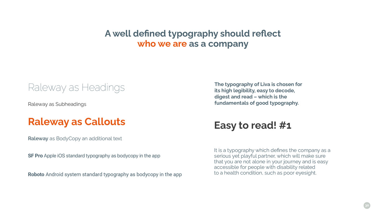
The typography chosen for Liva is Raleway which is available through Google fonts and is a Humanist typeface that is categorized by being friendly and easy to decode with strong legibility.
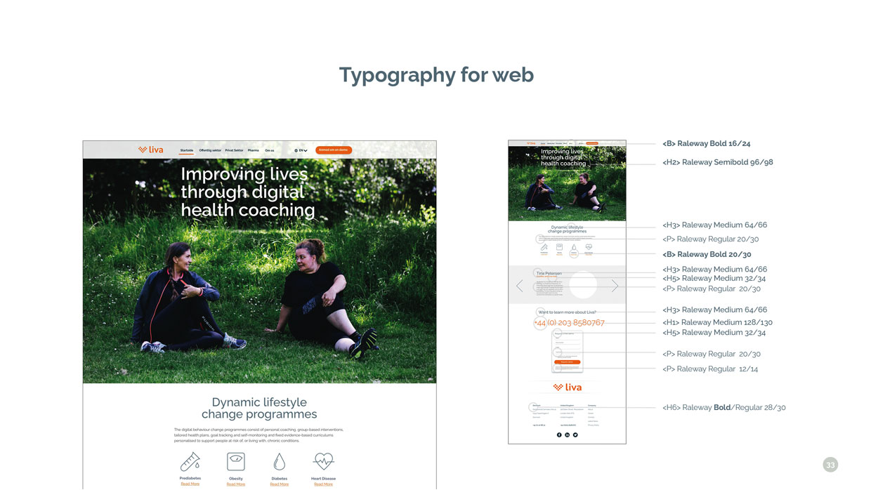
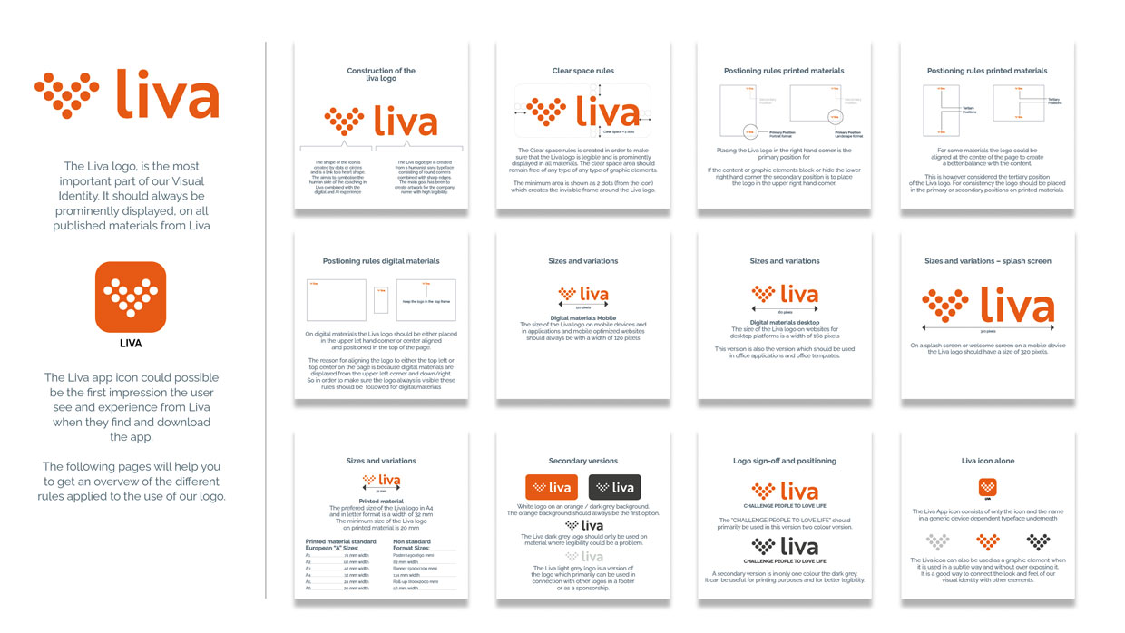
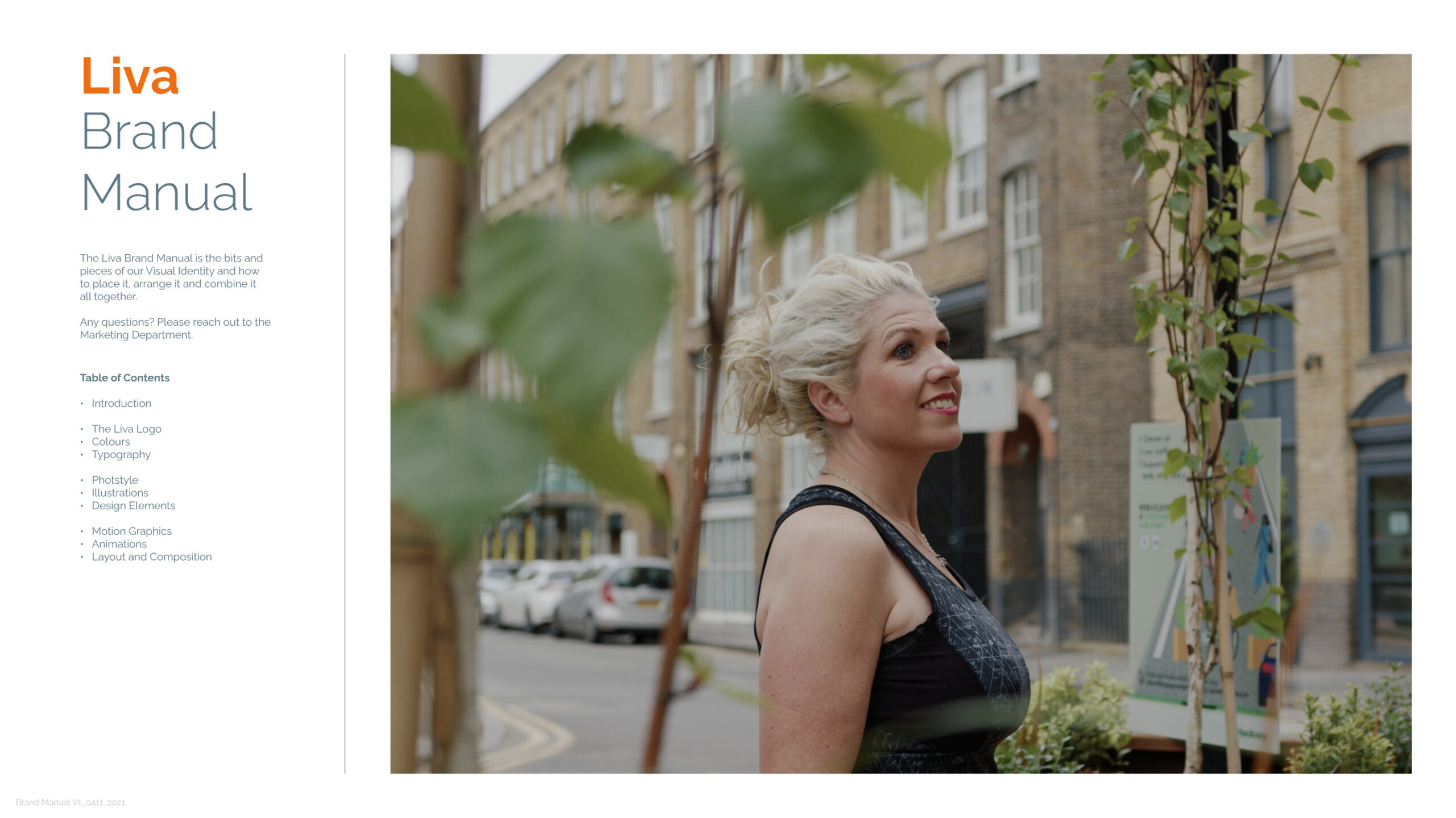
In the end, I created a full Brand Manual with the foundation and all the pieces to create the design for Liva Healthcare, and the Brand Manual is the core piece in the development of the website for Liva Healthcare which I created after the completion of the Brand Manual as well as a working mock-up of how the app could look and function.
![YNOTBOB [WHY NOT BOB?]](https://ynotbob.dk/wp-content/uploads/2020/10/YNOTBOB_Black.png)
![YNOTBOB [WHY NOT BOB?]](https://ynotbob.dk/wp-content/uploads/2020/10/YNOTBOB_White.png)