GO-Pen Design
Affordable insulin pen for all
GO-Pen is a very important project because they are in the business of making affordable insulin available for all. So when developing material for GO-Pen I always had an eye on how we could minimize the cost in the design and graphic development phase -because in the end, if GO-Pen develops a product that is priced at a good level, more patients will be able to use a pen system to inject insulin instead of a vial and a syringe.
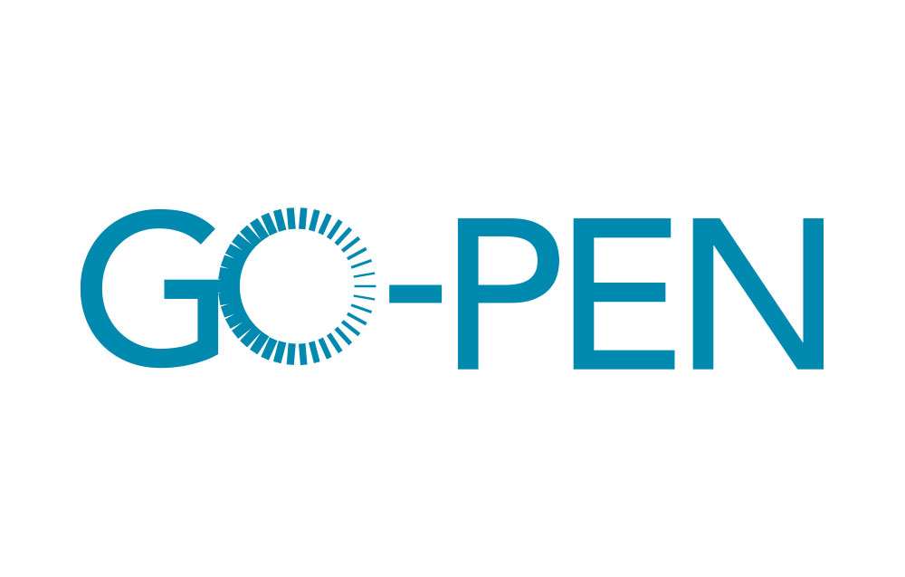
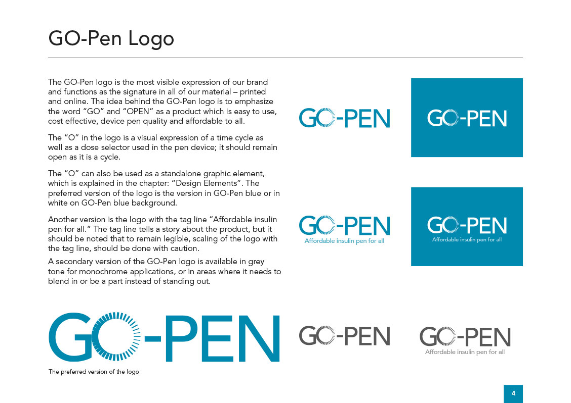
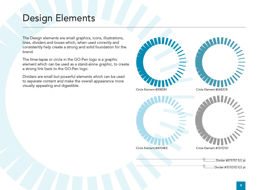
For GO-Pen I developed their Visual Identity and the logo, as an important part of their Visual Identity. The idea behind the logo is to use the “O” as the dial dose you have on top of the insulin pen and connect the Visual Identity to the product.
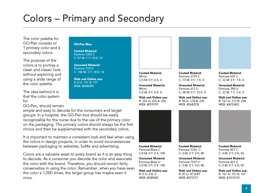
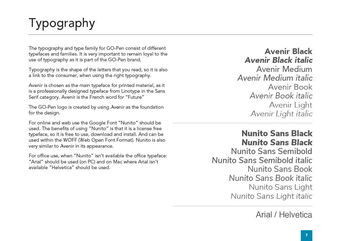

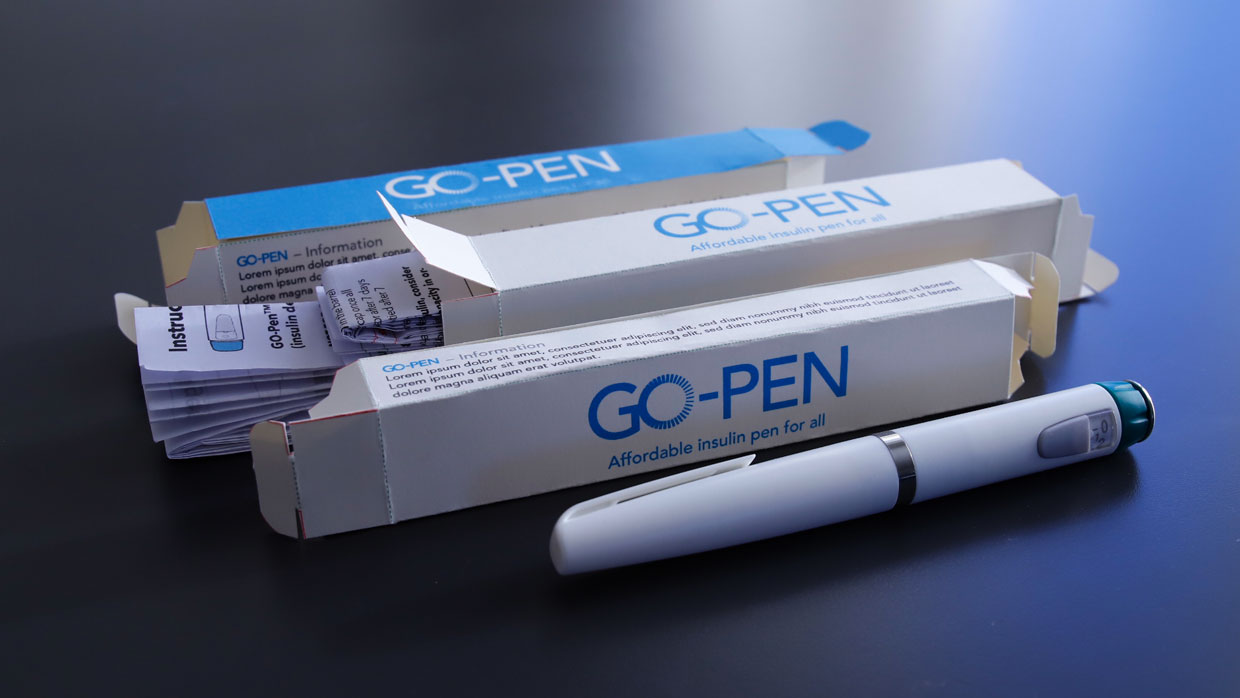
After developing GO-Pen’s Visual Identity I also created different prototypes of the packaging and how it can be designed and developed to make the production as lean as possible. Different mock-up of IFU were also developed and different folding methods and of course the right paper chosen so it can be folded and fitted in the packaging, but also with high opacity so printing on both sides is possible and easy for the patients to read and decode.
![YNOTBOB [WHY NOT BOB?]](https://ynotbob.dk/wp-content/uploads/2020/10/YNOTBOB_Black.png)
![YNOTBOB [WHY NOT BOB?]](https://ynotbob.dk/wp-content/uploads/2020/10/YNOTBOB_White.png)