Visual Identity Creation
To create a Visual Identity
A Visual Identity consists of different elements, often referred to as visual cornerstones. The visual cornerstones create the foundation, of the Visual Identity. A Visual Identity is usually linked, very close to the Brand Identity. Brand Identity is the foundation of your brand. And the Visual Identity is then the execution of the Brand, within the visual universe.
Visual Cornerstones for your Identity
Visual Identities can be scaled up according to the company size. It is always a good idea to at least have a few of the Visual Cornerstones in place when launching a company, brand, product, or service. It is also a good rule of thumb, for a start-up company, to use that energy and investment in a strong Visual Identity. In order to visualize your brand on different platforms. A good visual foundation is always a key indicator for success. Unfortunately also the other way around, as there are numerous examples, of good products and services, that fail to enhance their brand, and create a clear and consistent Visual Identity.



Different versions of Visual Identities
In larger global companies, a Visual Identity can be defined in different areas. In my 10 years working as a Designer in Novo Nordisk, I was managing and developing the Corporate Visual Identity often shorten as CVI. (And Visual Identity is often just named VI). The Corporate Visual Identity can be strong or not so strong, according to how your brand and market your company, products, and services.
Corporate Visual Identity (CVI)
In Novo Nordisk, the Corporate Visual Identity was rather strong. The rationale for having a strong Corporate Visual Identity, is the foundation of the company, and how you use it in your branding. In Novo Nordisk, the foundation was a “Branded House” strategy. Which is referring to a close visual connection, between the corporate brand, and all the products and services. For all the products there was a “Product Visual Identity” often referred to as PVI in business lingo. The Product Visual Identity was visually very closely linked to the Corporate Visual Identity. And the essence was the creation of a branded house, where the Corporate Visual Identity of each product, service, and other elements, all had a red thread in their visual communication. Linking them all together in a branded house.
Brand Strategy
The branded house strategy, made sense for a pharma company, like Novo Nordisk. Other companies often use a strategy, which is known as a House of brands platform. Where each product brand is not influenced by the Corporate Visual Identity. But have their own Brand Identity and Visual Identity. The House of brands strategy is often used in FMCG (Fast Moving Consumer Goods) segment, where there can be products that are competing against each other; therefore, they need to differentiate on their Visual Identity. In order to use different brand parameters and brand strategies to sell their products.
Hybrid Brand Strategy
The “Branded House” and “House of brands”, are traditionally the two common platforms, for your brand strategy. It is however sometimes a bit rigid, and not very flexible. There are also numerous other ways, to create brand platforms. Another one is the “Hybrid Brand Platform” where the “Mother Brand” also becomes a product brand, in line with the other product brands. The Hybrid Brand Platform can be hard to manage as the mother brand, usually has the strongest voice, so the Overall Brand Manager needs to be sharp, in order to not let the other brands feel neglected.
Visual Identity in a developing digital world
When the world is evolving and becoming more visual. Different ways of executing a brand and Visual Identities are being created. Endorsed branding and Personal Branding is another way, to carry out your Visual Identity. Today a brand and visual platform have to be more adaptive and fluid. Quicker to adjust to the different visual platforms. And very important, to be interchangeable. With the explosion of Digital Design and SoMe marketing, it is crucial to have a strategy in place, in order to execute the visuals effectively on all platforms.
Visual Identity
Cornerstones
examples
Logo
The logo used to be one of the first and main visual elements. The item you create first when you are building a Visual Identity. The reason why it is important is that the logo defines, and increases your brand recognition visually. In the digital world, a logo is not as important, as it was before. Today a great or unique name, which is SEO and SEM friendly, makes so much sense and is very important. A logo is however still so essential for your Visual Identity. (I have to say it as a designer ;-)). But there is some data to support it. Your brain remembers visual elements, better than text. The brain can process visual elements 60.000 faster, compared to text. …So why am I writing all of this? You are absolutely right It doesn’t make sense! So here are the visuals:
Creation of YNOTBOB logo
On top of this section, are a few examples and some sketches I made, when I created the logo for my company. It is also to visualize that it can go in a lot of different directions. My strategy for my brand was to keep it simple – A logo always has to work in monochrome colors, it used to be. Today you can create different variants and still make it work. It is however a good starting point, that it visually works in black and white.
The name of the game
The name for YNOTBOB is rather tricky. As it has “NOT” in it. Usually, you would try to avoid any negative connotations associated with your brand. So, it is something I had to be aware of when creating the visuals for the logo. And then there is the cross-language barrier. Native English speaking get it right away, as it is a common term to shortened “WHY NOT” To “YNOT”. Some Danes and non-native English-speaking customers, do have some trouble pronouncing my Company name. Until I say it: WHY NOT BOB? And then say, now I get it -It makes sense, it is funny. Of course, it is never a perfect thing, to have a name that can be difficult to say. But calling my company “Bobby Krøyers Design Studio”, “Bobby Krøyer Graphic Design” would just be so dull and not very creative. And definitely would not define, who I am as a Creative Designer. So YNOTBOB?
Colors
The Color scheme used in your Visual Identity can be SO important. Just think of some of the mega brands and how they own color, in a visual universe. And it didn’t happen overnight. It was just continuously working, and being consistent, in the use of color across different areas and channels, for a lot of years. Sometimes when a mega-brand rebrands themselves, they re-define their color scheme and lean upon fashion, instead of consistency in their Visual Identity. And I’m always thinking how many seeds, they just lost because of the change. Sometimes change can be a good thing, and it can be well investigated, and a good reason for it. Just remember to harvest what you planted, before starting all over, with your color scheme in your Visual Identity.
Primary, secondary, tertiary and supporting colors in Visual Identities
Primary colors are usually a few colors. Which defines the brand, they can also be linked to the logo (Which is very common). The primary colors are the colors, you want to be associated with the brand.
Think of
- T-Mobile = Magenta Pink
- UPS = Brown (and Yellow)
- McDonalds = Red and Yellow
…and so on –You get the picture


Secondary Colors
To support the Primary colors, you often have a secondary color palette. Those colors should be carefully chosen, so they complement the Primary colors. It is my job as a Designer, to make sure that the colors are supporting, and in harmony with the primary colors.
Supporting Colors
On the third level of the color hierarchy, there are the supporting or tertiary colors. Those are colors that support the primary, and secondary color palette. They are also important, but one the third level is not as vital as the primary and secondary. When creating a visual color universe, it is the last part. It can be postponed until needed. But of course, always a good idea, to have a few of them in place. Think of supporting colors, like the colors used for less important CTA’s on your websites, or as the colors you need in MS Excel, to differentiate and define certain areas.
Color systems in a visual world
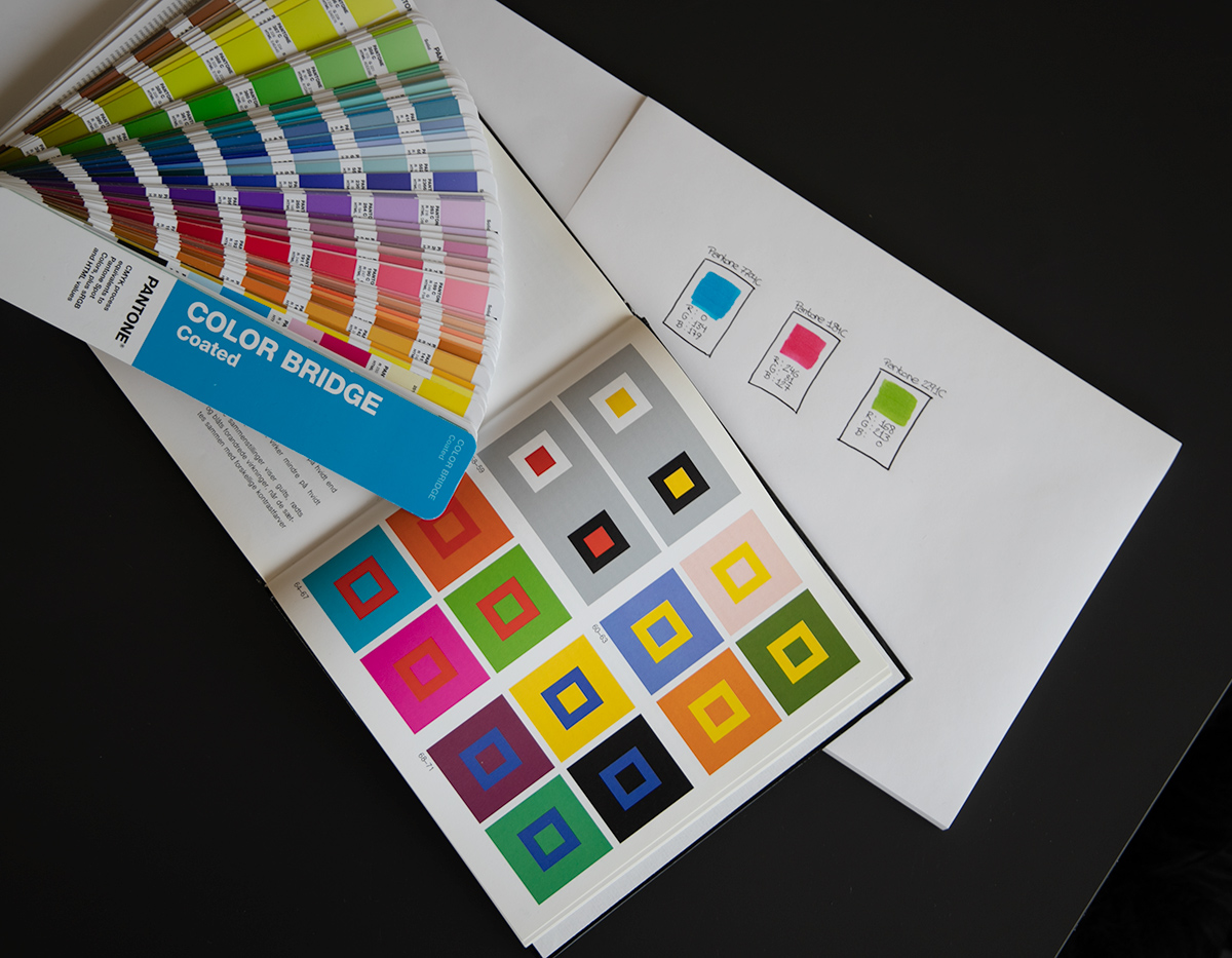
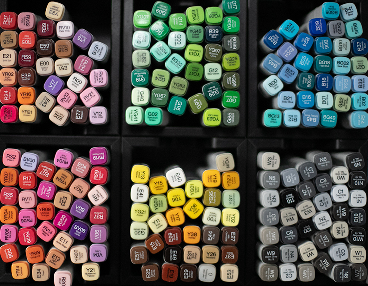
Colors defined for print and digital, are unfortunately two different visual worlds. Printed colors can somehow be controlled, through the Pantone® color system, RAL, and NCS, or by printing in CMYK. CMYK is however a printing technique, made out of different printing plates C=Cyan M=Magenta Y=Yellow and K=Key (Black). So, you can’t always be 100% sure, that it is correct as it can be device-dependent. For digital colors it is the same, there used to be a standard palette of 216 Web-safe colors. But even with them, you can’t control the quality of people’s monitors and the light, contrast, and surroundings. And it all feeds into the experience of color. For digital use, it can be tricky, but you have to relate, to some color standards in order to define it.
Defining a color
When I’m defining a color scheme for a client, I always start up with the Pantone® Matching system. The Pantone® colors are can colors which are solid without raster. So when it is defined, you can translate them into other color systems. CMYK is raster-based and made out of small dots combined. So, a color should always be defined, as a Pantone® number first and foremost. Later on, it should be translated, into RGB, CMYK, and other color systems.
Color theory
All the work I do with colors in Visual Identities is based on the groundbreaking work of Johann Wolfgang Goethe and Johannes Itten. And the inspiration they gained from the findings Isaac Newton, made with the prism and the power of light. When I create a color scheme for a Visual Identity, it is never “how do I feel today”. So never based on a subjective stimulus or influences about the use of colors. It is always very difficult to set the tone when it is feelings-based. So the use and choice of colors always have to be objective.
Typography
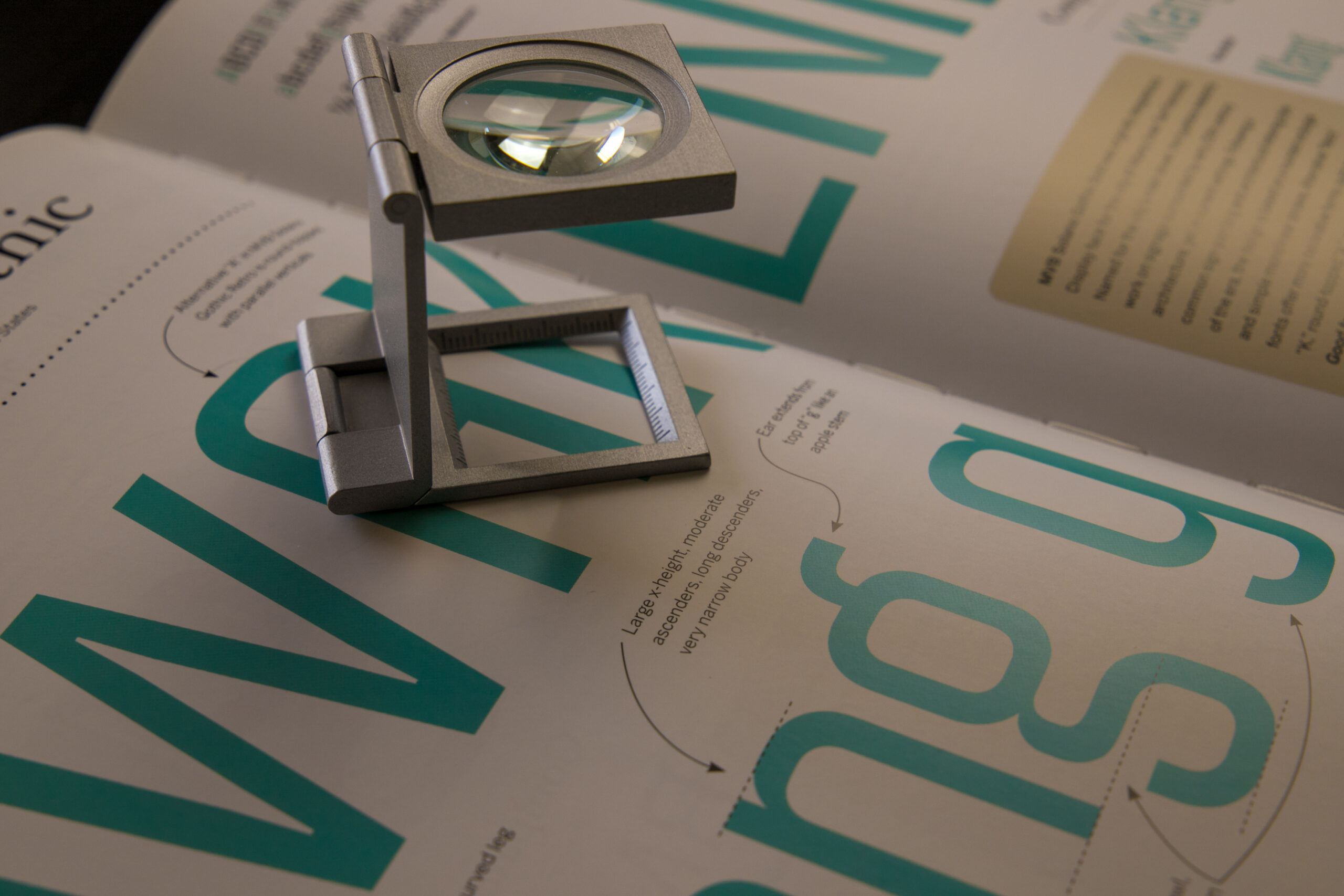
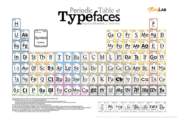
Typography and typefaces are vital elements in any Visual Identity. And working with typography has always been very close to my heart. A lot of people working with communication say, why is that even important? It is just text! But trust me, it is so important. For the kind of impression, you want to make on your audience and target group, it is so essential for your brand reputation.
Typography case stories
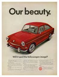
Working with Visual Identities and making lectures, and presentations around Visual Identity. I always had a presentation about the power of typography, and how to use it. The part is very focused on customized typefaces, and how to effectively use them, in your brand and visual identity work. Automobile brands have always been, very quick to use the power of typography. And customized typefaces in their Visual Identity is very common. One prime example of that is Volkswagen, who could just write “Das Auto” and you knew right away that it was Volkswagen. The typeface they used wasn’t even an extraordinary special design, but a slightly customized version, of the typeface “Futura”. Volkswagen had just been consistent, in using the typeface since the 1970s, so now they could write “whatever”, on a blue background, and you instantly knew it was Volkswagen. –That is the power of typography! And then they changed it… But that is a whole other story. What a lot of lost branding, and identity work, when that happened.


Typographic Systems
In the past, you should have a Typography, for printed use, one for digital use, and maybe a third one for office use. As a result, it was 3 different typefaces. Which could be kind of blurry, for your brand recognition, and your visual identity. With the evolution of cloud-based software and typography. You can now store your typography online, and it can be seamlessly integrated. And it works on professionally printed material, as well as on your website and digital design creations.
Photo Style
A significant photo style can benefit any brand and Visual Identity. And set the tone, you want your target group to experience. Some brands use different variations, it can be black and white photos, over-saturated, over contrasted photos, etc. And in the 1990s a lot of brands were using duotone photos. It is also how the photo style, is defined. Is the perspective from up top, frog perspective or wide-angle, up close, etc. A lot of different factors, in creating a photo style. And then there is the subject. Is it landscapes, humans, products? And it is of course usually linked, to the product or service, you want to sell. The authenticity of the subject is also very important, some companies, use stock or royalty-free images, as their photo style. And it can work really well, as stock photos tend to be very neutral. When the same stock image is shown, on a competitor page or exhibition. They usually regret the decision, to use stock images. Using a professional photographer should be a cost, you should count into your budget when creating a Visual Identity.


Illustration Style
Certain brands create their Visual Identity based on an illustration style. It can be very powerful, and with fewer pixels to absorb for the user. It is also clear and precise communication. Another benefit of an illustration style is that you can animate it. So it expands your visual universe and can be used on a lot of different platforms and in SoMe campaigns. An illustration style, is usually also how you design your icons and pictograms. Sometimes they can be interlinked together, so the lines between the different styles, are broken down. The benefit can be a unique style for the Visual Identity.
Design Elements
A design element can be a lot of different items. Some companies use it as a bucket, for the “things we can’t define in boxes”. It can also be very well defined, and with a strong link to the Visual Identity. And the strategy of the brand. It can be the shape of a photo frame, how you use a line or a box on a webpage. How is your CTA styled, and how is the drop shadow, on different elements defined? Is the visual style rough? Is it bold? Or is it neutral? How are different elements translated, from digital to printed material, how do they appear in an e-mail marketing campaign? Compared to a large format banner on a building, it should be seamless, without any visual drop-off, in how the design elements are defined, in your Visual Identity. Design Elements can be a various list of things, even composition, and a layout could be considered a design element.
Motion Graphics
In a world where the attention time is so short, to reach your target group. A clear and well-defined Motion Graphics strategy, in your Visual Identity, is so important. When creating a strategy for how to use Motion Graphics, it should always be linked to either your photo style or illustration style. Or it can be both, it depends on the kind of style, you are using. With Motion Graphics, you can deliver a message in a few seconds. In traditional marketing and old-school design, you need to invite the recipient, into the material, and use graphic design tricks, to get them to read and understand the message. Motion Graphics can also benefit from digital design, and how convenient, it is for the user to hit a CTA in a video. It is so much more difficult when you have a printed advert, and you want the user to interact, and buy something in a store or visit a website.
Cognitive nudging and priming
Another very important element, when creating a Visual Identity. This is how you influence, and prime the recipient’s brain, and nudge them into a path you want them to follow. It is a very delinquent subject, but nevertheless, it is in the essence of design. Visually you want the user, to react to your design. It is also the essence of a Visual Identity, to link the different elements together, and create and plant those seeds, in the recipient’s brain. A Strong Visual Identity, will influence the user, consumer, recipients, and the behavior they make.
Visual Identity Conclusion
The different takes I described on this page, are just the tip of the iceberg. And it is some of my thoughts, on Visual Identity management, and development. You can always contact me, to get into a dialogue, on how we can create a top-notch, and strong Visual Identity for your Brand. © Bobby Walseth Krøyer 2021.
Pantone® and the Pantone Matching System is Copyrighted © Pantone LLC
Periodic Table of typefaces is Coprighted © Camdon Wilde Squidspot.com
VW adverts and logo is copyrighted © Volkswagen
T-Mobile logo is Coprighted © T-Mobile
UPS logo is Coprighted © UPS
McDonalds logo is Coprighted © McDonalds
![YNOTBOB [WHY NOT BOB?]](https://ynotbob.dk/wp-content/uploads/2020/10/YNOTBOB_Black.png)
![YNOTBOB [WHY NOT BOB?]](https://ynotbob.dk/wp-content/uploads/2020/10/YNOTBOB_White.png)
