GN – Strategisk design
Grafisk Design samt produkt design for en Danmarks ældste og mest innovative virksomheder
GN invented the internet – so no pressure here of delivering a top-notch graphic design product 🙂
The task was to illustrate GNs strategy in a clear and concise way. So a lot of different sketches and illustrations were created to figure out the visuals and the overall look and feel.
The aim was not to create an illustration style but to use the illustration sketch style to determine the direction.
A lot of sketches were created and we ended up in a mosaic style with pictures of the different product brands within GN being represented.
6 different enablers/priorities where the focus point and it was created for print, posters, and digital. In the end, I also created an animation as a screensaver for use on the computers internally in GN.
(!) Note: Due to the confidentiality of GN I can’t showcase all the different graphic design solutions.
Kunde:
GN - Store Nord
Projektdato:
februar
Kategori:
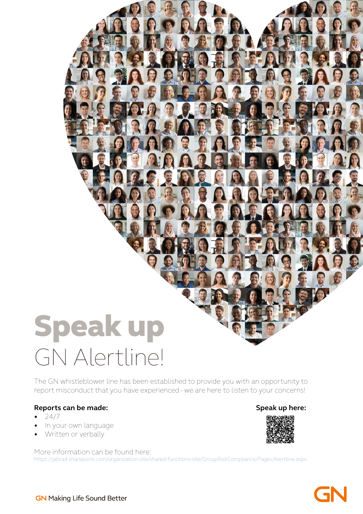
Different concepts created for the GN Alertline with a “Speak up” campaign aimed at people feeling safe to report anything which is a concern to the employee. Different concerns were created around the idea, that it should not be a red hot alarm, more of a speaker system, where there is someone at the other end taking your call and taking you seriously.
I created different animations/motion graphics sketches based on the concepts and posters and banners for the intranet in GN. They can be seen below here:

![YNOTBOB [WHY NOT BOB?]](https://ynotbob.dk/wp-content/uploads/2020/10/YNOTBOB_Black.png)
![YNOTBOB [WHY NOT BOB?]](https://ynotbob.dk/wp-content/uploads/2020/10/YNOTBOB_White.png)