The Society Visual Identity
A Visual Identity and Brand Identity created for a jewelry brand based in Hong Kong
The Society is a Hong Kong-based jewelry company specialized in selling unique designed jewelry for customers mainly located in Hong Kong and as the main target group is ex-pats living in the city.
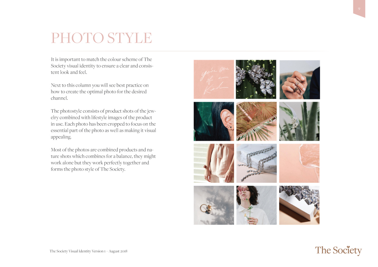
The task was to create the visual cornerstones for the company (Logo, Colours, Typography, Photo style, Design elements). And when all the elements were created and approved to take it to the next level by creating a design manual as a guide for further development of graphic design for packaging, Instagram, Facebook, etc.
The elements are created by having the target group in focus and also by having a strategic focus on how to use the elements in a digital way as well as on a box printed or embossed with the logo. So it had to work in the digital age as well as the more old-school printing business.


![YNOTBOB [WHY NOT BOB?]](https://ynotbob.dk/wp-content/uploads/2020/10/YNOTBOB_Black.png)
![YNOTBOB [WHY NOT BOB?]](https://ynotbob.dk/wp-content/uploads/2020/10/YNOTBOB_White.png)